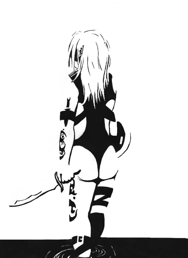
I shaded and highlighted her, the day before I did the picture above. This is my first time using PaintShop Pro7 properly. Give your comments honestly, I’d appreciate it! ^^
I like em, and I think the more you work at it the better you’ll get with little details like shading and positioning, and they’ll help make the whole package more "oo, ah!" The monochrome one was neat, its nice to say a lot with just a few lines, ooh, just noticed, sweet ava, hehee. I know it’s a lot of work, but composing a background to complement a picture really does bring it out sometimes. Keep postin’
Av
I was tempted to do a background on the monochrome pic, but it would be hard to distinguish her from the background, using just black. I agree though, that the second one should’ve had one though, it does seem a little plain. Thanks!
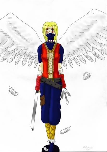
The second one is okay but some of the proportions look a bit out. Her head’s too small. Her breasts look a bit odd, but I’m not sure why exactly. Her navel needs to be higher up, she has quite a long body but her navel still looks a little bit too near her crotch, it’d be better up where the criss-crossing bits are.
I think her calves need beefing up a bit, they’re a bit spindly and the darkness around her feet makes it a bit hard to see what’s going on. Her hips look good though and from the neck down her body, legs and arms look in nice proportion.
The texture on her wings and the floating feathers is nicely done with the shading. I think her body might benefit from a greater range of shades to make it even more 3D looking. It’s got good shadows cast by parts of her outfit but she still looks a bit flat overall.
As I said, the winged woman was my first attempt at CG colouring/shading, so it’s nice to have some helpful advice to let me advance from the noobie stage. ^^;
I know what you mean about her breasts. The problem is that the body doesn’t flow into them, it flows around them by mistake. In short, I made it look like a man with boobs glued on! lol